
Tuesday, January 19, 2016
Wednesday, January 6, 2016
Harmony
In Interior Design we had to design a Christmas room that has harmony. Harmony is when"unity and variety are effectively combined."

The theme of my Christmas room is silver and gold; just like the Christmas song "Silver and Gold." The color, and Christmas theme, gives the room harmony.
Kitchen for Family of 5
For this assignment we had to create a kitchen that will work for a certain amount of people, and what ever shape we think works best.


This is the floor plan of the kitchen that I designed. I made a kitchen that would work for a family of five.

The shape I chose for the kitchen was the L shape with an Island. (Here is a link to other shapes) In the image above I have shown the space, or path, of where someone would prepare food. I believe that the L shape kitchen, with island, is the best for anyone (or any family) that loves to entertain. I also love this shape because when you are in the kitchen you don't have to feel so separated from everyone because the kitchen is open rather than closed.

Not only does the island and L shape kitchen give you more social space, it gives you more space to cook. When you have a big family, like a family of five.

I also made the kitchen pretty big because I'm guessing, from what I've seen, kids will be at foot of the parents.
Friday, January 1, 2016
Scale and Proportion

This week in Interior design we had to create a room with accurate proportions, and using items from Target's Threshold home line. Threshold is designed by Emily Henderson.

In this project I didn't exactly get use ALL Threashold items because of the color scheme I was going for. I did use quite a lot though!
In this project I didn't exactly get use ALL Threashold items because of the color scheme I was going for. I did use quite a lot though!
Tuesday, December 22, 2015
Homestyler 3D Room
In Homestyler you can design your own room, and floor plan. So this week in Interior Design we were told to recreate our bedrooms. We had to approximate the size of our rooms, and then design it any way we wanted to. In my room I have this built in wood bed loft thing that I have been wanting to get rid of for YEARS, and in this design I got rid of it!! I want a bigger bed so of course I put in one.


These pictures above are of my almost dream room. It's not exact, but its pretty close!


Wednesday, December 16, 2015
Emphasis

In class this week I was supposed to create a room with some object in the room as the emphasis. Emphasis is when an area or object in a creation draws attention, and becomes the focal point. The focal point, or emphasis in my creation is the painting. When I look at this room the first thing I look at is the painting. It's bright colors, and with how big it is, draws your eyes to it. Emphasis is one way to make your room complete, and bring excitement to it.
Monday, December 14, 2015
Rhythm
Today in Interior Design we learned about Rhythm. Rhythm in music is more like a beat, but in design it's the path that our eyes follow, or a repetitive use of an element. Things that could be a rhythm could be things like repeated pictures on a wall, the way a room feels repetitive (like a circular room), or a small object to a big object. Which these are all examples of the three rhythms we talked about: Repetition, Radiation, and Gradation.


Repetition:
Is when an object, color, or the way furniture is set up is repeated.
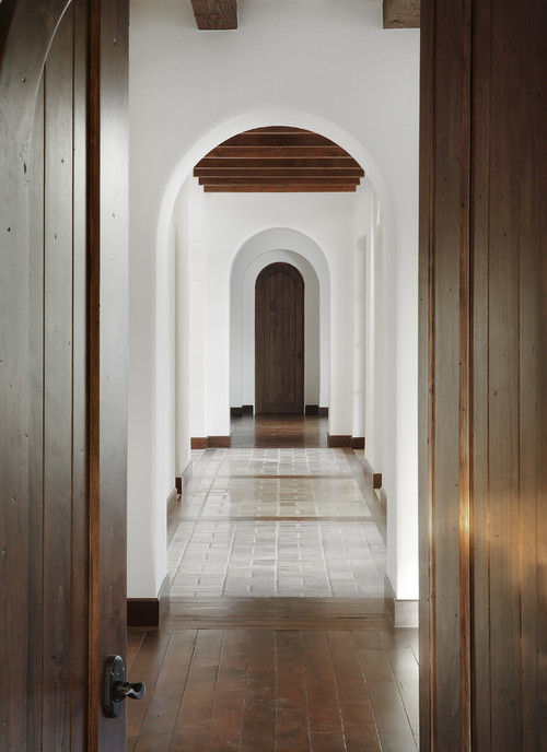
These two images are examples of repetition. In the first image the light fixtures, stools, and the white color of the room are being repeated. The stools and lights stick out the most, and they make our eyes follow from left to right along their pattern. In the second image the arches go down the hall repeatedly. The rhythm in this room make our eyes look down the hall.
Radiation:
Is when the rhythm is in a circular pattern.
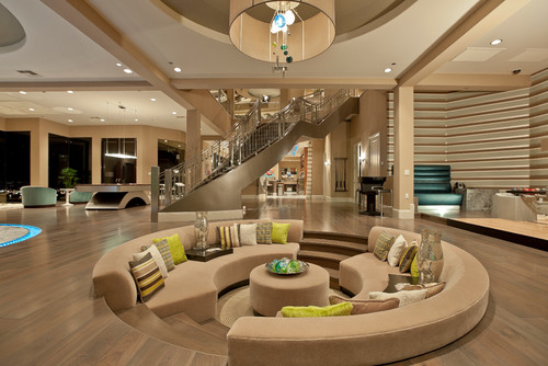
In these two photos the furniture is placed in a circular rhythm. In the first image the circle table and the chairs being placed around the edge of it makes the room have that radiation pattern. In the second image the furniture is placed in a circular den, and our eyes follow the shape.
Gradation:
Is when something is in the pattern of big to small, small to big, dark to light in color, or light to dark. A better way to explain is in the pattern there is only a small change as is goes along.
Gradation:
Is when something is in the pattern of big to small, small to big, dark to light in color, or light to dark. A better way to explain is in the pattern there is only a small change as is goes along.
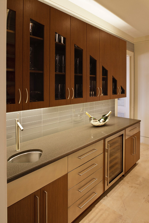
In the first image the gradation is found in the cabinet's windows. The pattern follows from big to small. In the second image the color is the gradation, and the pattern is dark to light repeated.
The rhythm of a room has to be comfortable and appealing to the eye to be a pattern. The three patterns we focused on were Gradation, Repetition, and Radiation. Rhythm is one of the basic elements that ties a room, or design, together.
Subscribe to:
Posts (Atom)