Tuesday, December 22, 2015

Homestyler 3D Room

In Homestyler you can design your own room, and floor plan. So this week in Interior Design we were told to recreate our bedrooms. We had to approximate the size of our rooms, and then design it any way we wanted to. In my room I have this built in wood bed loft thing that I have been wanting to get rid of for YEARS, and in this design I got rid of it!! I want a bigger bed so of course I put in one.


 These pictures above are of my almost dream room. It's not exact, but its pretty close!

Wednesday, December 16, 2015

Emphasis


In class this week I was supposed to create a room with some object in the room as the emphasis. Emphasis is when an area or object in a creation draws attention, and becomes the focal point. The focal point, or emphasis in my creation is the painting. When I look at this room the first thing I look at is the painting. It's bright colors, and with how big it is, draws your eyes to it. Emphasis is one way to make your room complete, and bring excitement to it.

Monday, December 14, 2015

Rhythm

Today in Interior Design we learned about Rhythm. Rhythm in music is more like a beat, but in design it's the path that our eyes follow, or a repetitive use of an element. Things that could be a rhythm could be things like repeated pictures on a wall, the way a room feels repetitive (like a circular room), or a small object to a big object. Which these are all examples of the three rhythms we talked about: Repetition, Radiation, and Gradation.

Repetition:

Is when an object, color, or the way furniture is set up is repeated.


These two images are examples of repetition. In the first image the light fixtures, stools, and the white color of the room are being repeated. The stools and lights stick out the most, and they make our eyes follow from left to right along their pattern. In the second image the arches go down the hall repeatedly. The rhythm in this room make our eyes look down the hall.

Radiation:

Is when the rhythm is in a circular pattern.


In these two photos the furniture is placed in a circular rhythm. In the first image the circle table and the chairs being placed around the edge of it makes the room have that radiation pattern. In the second image the furniture is placed in a circular den, and our eyes follow the shape.

Gradation:

Is when something is in the pattern of big to small, small to big, dark to light in color, or light to dark. A better way to explain is in the pattern there is only a small change as is goes along.


In the first image the gradation is found in the cabinet's windows. The pattern follows from big to small. In the second image the color is the gradation, and the pattern is dark to light repeated.

The rhythm of a room has to be comfortable and appealing to the eye to be a pattern. The three patterns we focused on were Gradation, Repetition, and Radiation. Rhythm is one of the basic elements that ties a room, or design, together.

Thursday, December 10, 2015

Symmetrical and Asymmetrical Balance

Symmetrical:


Symmetrical- Made up of exactly similar parts facing eachother or around an axis; Showing symmetry.

Asymmetrical:


Asymmetrical-  Having parts that fail to correspond to one another in shape, size, or arrangement; lacking symmetry.

Monday, December 7, 2015

The Great Gatsby


This past week in Interior design we watched my favorite movie, The Great Gatsby. The movie is very beautiful, bright, and glamorous. In class we were to design a room or mood board that had the themes of The Great Gatsby and all it's glam. Our "client" is obsessed with The Great Gatsby, and we have to style rooms to the theme, and not the exact sets.

For my first room I tried to capture the felling of the Gatsby House's style. I used a lot of gold because it brings out an expensive feeling. Gatsby had a lot of money, so all of the gold represents this. In this
creation I used the shiny materials in my decorating that this blog said was a Gatsby theme. The same blog informed me that a chandelier is a perfect choice of lighting. It states that it adds more glam, which is the Gatsby theme. I stayed true to the Art Deco syle of the 20's by using an Art Deco wallpaper, flooring, and coffee table. I also noticed while looking at different scenes from the movie that a lot of their set ups were very symmetrical. I tried to capture this feeling in this room, and below I have examples of the symmetry.

Gatsby's Room:


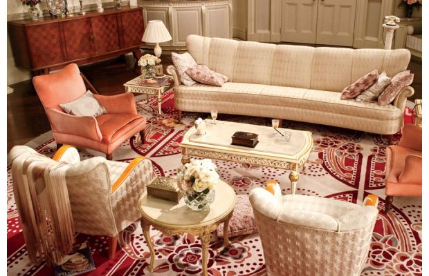
The Buchanan's White Room:


My second creation is a simple, but romantic and shiny room. I tried to give this room a more feminine feeling because I feel it brings out more of the glam. I also used mirrored furniture and fixtures to bring out a polished, and clean feeling. In this piece I also feel I used more Art Deco decor than the one before. For color in this room I stayed closer to the Monotone Gatsby color scheme by using whites, and light colors. The "pop" of color in this room is the black accents I have added. If you watch The Great Gatsby they have many pops of color to make things more bold, and exciting.


The Great Gatsby is exciting, artsy, and of course GLAMOROUS!!! For this reason I put in shiny, colorful, and exciting objects to bring out the Gatsby in each room.