Tuesday, December 22, 2015

Homestyler 3D Room

In Homestyler you can design your own room, and floor plan. So this week in Interior Design we were told to recreate our bedrooms. We had to approximate the size of our rooms, and then design it any way we wanted to. In my room I have this built in wood bed loft thing that I have been wanting to get rid of for YEARS, and in this design I got rid of it!! I want a bigger bed so of course I put in one.


 These pictures above are of my almost dream room. It's not exact, but its pretty close!

Wednesday, December 16, 2015

Emphasis


In class this week I was supposed to create a room with some object in the room as the emphasis. Emphasis is when an area or object in a creation draws attention, and becomes the focal point. The focal point, or emphasis in my creation is the painting. When I look at this room the first thing I look at is the painting. It's bright colors, and with how big it is, draws your eyes to it. Emphasis is one way to make your room complete, and bring excitement to it.

Monday, December 14, 2015

Rhythm

Today in Interior Design we learned about Rhythm. Rhythm in music is more like a beat, but in design it's the path that our eyes follow, or a repetitive use of an element. Things that could be a rhythm could be things like repeated pictures on a wall, the way a room feels repetitive (like a circular room), or a small object to a big object. Which these are all examples of the three rhythms we talked about: Repetition, Radiation, and Gradation.

Repetition:

Is when an object, color, or the way furniture is set up is repeated.


These two images are examples of repetition. In the first image the light fixtures, stools, and the white color of the room are being repeated. The stools and lights stick out the most, and they make our eyes follow from left to right along their pattern. In the second image the arches go down the hall repeatedly. The rhythm in this room make our eyes look down the hall.

Radiation:

Is when the rhythm is in a circular pattern.


In these two photos the furniture is placed in a circular rhythm. In the first image the circle table and the chairs being placed around the edge of it makes the room have that radiation pattern. In the second image the furniture is placed in a circular den, and our eyes follow the shape.

Gradation:

Is when something is in the pattern of big to small, small to big, dark to light in color, or light to dark. A better way to explain is in the pattern there is only a small change as is goes along.


In the first image the gradation is found in the cabinet's windows. The pattern follows from big to small. In the second image the color is the gradation, and the pattern is dark to light repeated.

The rhythm of a room has to be comfortable and appealing to the eye to be a pattern. The three patterns we focused on were Gradation, Repetition, and Radiation. Rhythm is one of the basic elements that ties a room, or design, together.

Thursday, December 10, 2015

Symmetrical and Asymmetrical Balance

Symmetrical:


Symmetrical- Made up of exactly similar parts facing eachother or around an axis; Showing symmetry.

Asymmetrical:


Asymmetrical-  Having parts that fail to correspond to one another in shape, size, or arrangement; lacking symmetry.

Monday, December 7, 2015

The Great Gatsby


This past week in Interior design we watched my favorite movie, The Great Gatsby. The movie is very beautiful, bright, and glamorous. In class we were to design a room or mood board that had the themes of The Great Gatsby and all it's glam. Our "client" is obsessed with The Great Gatsby, and we have to style rooms to the theme, and not the exact sets.

For my first room I tried to capture the felling of the Gatsby House's style. I used a lot of gold because it brings out an expensive feeling. Gatsby had a lot of money, so all of the gold represents this. In this
creation I used the shiny materials in my decorating that this blog said was a Gatsby theme. The same blog informed me that a chandelier is a perfect choice of lighting. It states that it adds more glam, which is the Gatsby theme. I stayed true to the Art Deco syle of the 20's by using an Art Deco wallpaper, flooring, and coffee table. I also noticed while looking at different scenes from the movie that a lot of their set ups were very symmetrical. I tried to capture this feeling in this room, and below I have examples of the symmetry.

Gatsby's Room:


The Buchanan's White Room:


My second creation is a simple, but romantic and shiny room. I tried to give this room a more feminine feeling because I feel it brings out more of the glam. I also used mirrored furniture and fixtures to bring out a polished, and clean feeling. In this piece I also feel I used more Art Deco decor than the one before. For color in this room I stayed closer to the Monotone Gatsby color scheme by using whites, and light colors. The "pop" of color in this room is the black accents I have added. If you watch The Great Gatsby they have many pops of color to make things more bold, and exciting.


The Great Gatsby is exciting, artsy, and of course GLAMOROUS!!! For this reason I put in shiny, colorful, and exciting objects to bring out the Gatsby in each room.

Thursday, November 19, 2015

Space

Space, The final frontier... I don't literally mean Space the place where other planets are, but the space you have in your home. This week in Interior Design we are learning about the Element of Design: Space. We have defined space as "The three denominational area with which the designer works." This week's task was to design a New York City Flat, and try to decorate the tiny space to make it a complete home. To make a complete home you need a kitchen, a bedroom, a living space, and a bathroom. A Flat is an open space, that has all of these needs, on one floor.
This is the floor plan I made of a flat in Gabberts. While making this room I REALLY had to keep in mind I needed to make the space comfortable, and not too cluttered. While designing this room I was trying to make it feel, and look, big enough for guest. While creating the kitchen I was thinking about this as well. Instead of putting a kitchen table in the way I decided to just create a breakfast bar. This way while you are cooking people can sit in the kitchen with you. For that reason is also why I have the kitchen opened up to the living room. I know that a lot of people need their own private place, and for most people that is their bedrooms. I made the bedroom more private by creating the illusion of a wall with a closet. By placing the "bedroom" in the corner space it also created a more private area because there are walls all around the room. I also chose to keep the furniture a neutral white color because I felt it looked more professional. 
A floor plan is a great way to help design your home. Using a floor plan you can actually see the measurements of your space, and you can fit everything perfectly. This is why using Gabberts was such an awesome opportunity! Space is the space in your home you design, and live in, so keep your space creative!

Monday, November 9, 2015

Texture

Texture is the second Element of Design we are learning about this week in Interior Design. You need texture to make a room whole. There are actually three different types of textures: Visual, Tactile, and Audible. We had to create a room, and point out all of the main textures in bedded throughout it. I created a fall room because it is the season, and I am very obsessed with it. I also feel that it can bring an unique feeling to a room. (You can see the room I created in Polyvore below.)


Visual Texture:

Visual Texture is when you can see the texture, but you could not feel it with touch. My example of visual texture would be the round wooden coffee table in the middle of the room. By looking at it you can see the rough texture, but if you were to run your hands across it you would not feel the roughness, but you would feel a smooth surface.


Tactile Texture:

Tactile texture is when you can actually feel the texture of a surface, or object. In the room I created If you were to run your hands across the rug you could feel the fur, and softness that it appears to have.


Audible Texture:

Audible Texture is when you can hear the texture of something. Certain objects or cloth can have a certain sound when you touch them. The leaf wreath that I have placed in my room is audible because if you were to touch it you would be able to hear the sound of the leaves rub against each other and crinkle. 


Texture also gives us moods and different feelings about a room. Smooth textures give us a formal feeling while rough textures would give us a more informal feeling. If walls, like in my creation, are smooth and not textured it makes the room feel bigger. If walls are textured it makes a room feel smaller, so texture also effects the size of a room. In my creation I believe the mood is warm, but also cool at the same time. I feel that I tried to represent the feeling of fall. The feeling of to me is chilly outdoors, and warm cuddly, sit by the fire, insides. I tried to capture this feeling with all of the objects, and the room I chose to design. 


Thursday, November 5, 2015

Types of Lines

    Line is defined as," A long, narrow mark or band." In Interior Design we use lines to capture the feeling of a room. We use many different types of lines to bring a room to life like, Horizontal, Diagonal, Vertical, and Curved. We also have Functional and Decorative lines. All of these lines help us design a perfect room using the Elements of Design. 

Vertical Lines:

Definition: "At right angles to a horizontal plane." In Interior Design Vertical Lines give a room a feeling of dignity and especially height. Our eyes tend to follow the lines up when a room, or design, has vertical lines. Because of  this it makes the room, or object, appear taller. In this room you can see the three rows that your eyes follow up; continuing into the ceiling. The living room appears taller and formal.


Horizontal Lines:

Definition: "Parallel to the horizon of the plane." When we use Horizontal Lines in design we typically use them to make a room seem wider. We also use them to make a room feel relaxed, and casual. In the image below the horizontal lines basically outline the room; especially the back wall. They also bring a very casual feeling to, what is supposed to be, a casual kitchen.


Diagonal Lines:

Definition: "A straight line joining two opposite corners of a shape." Diagonal Lines are used to make a room exciting, and interesting. I think these stairs are very exciting with their exposed diagonal lines. The wood flooring in the home even follows the diagonal pattern. 


Curved Lines:

Definition: "A line or outline that gradually deviates from being straight for some or all of it's length." Curved lines are used to make a room feel feminine and soft. I think they also bring an interesting look into a room. This little library feels very soft and cozy with all of it's curved lines. 


Functional Lines:

Functional Lines are the lines that are built into your home. Lines like this would be found around and in doors, windows, walls, and stairs. In the hallway below you will notice that the walls are curved, and even the door is. 


Decorative Line:

A Decorative Line are lines that are one walls, furniture, and the way things are placed in your home. In the pantry below the patterned wallpaper gives the wall a horizontal feeling; even though the built-in shelves could have given it a horizontal feeling.


In Interior Design we need lines to help build a perfect room. A perfect room has all of the Elements of design to bring it all together and make it feel complete. Line is just one of the factors a room needs to create an awesome look!

Tuesday, October 27, 2015

My Experience on Summit Ave.


On the Summit Ave. Tour we saw many big and extravagant houses! Here I will be explain the trip and giving you all the info on how you can take the tour yourself, or learn a couple things about the homes. I will also list the houses you MUST see and know about.

The James J. Hill house was the first place that we stopped and the people that work there (Summit Ave. Walking Tour) gave us the tour. The James J. Hill house was the biggest house on Summit Ave.

The second house we were introduced to was the house to the right of The James J. Hill House was The Louis Hill House. This house used to belong to one of James' sons. You can learn more about Louis W. Hill by clicking the link I have embedded in his name.


The Italian Beaux Arts Mansion was one of my favorite houses that we saw on the tour. I believe it was modern for it's time, and it is very pretty. I also like how it has a side entrance, it gives it an interesting feel.


The James J. Hill House Carriage House is a beautiful remodel. It's rustic and modern. It was on of the most interesting things I saw on the trip. The house is actually for sale right now. 

The Summit Ave. Walking Tour is a must do/see. It has amazing history (which you can find here) and it's just really interesting to look at these beautiful, but historic homes. I had a lot of fun looking at the homes and learning about them because I love to look at homes, and interior designs of them. I think that anyone, like me, who likes to look at or just learn about homes should take this tour. I also believe if you live in Minnesota it's a must.

Friday, October 23, 2015

Cass Gilbert vs. Clarence Johnston

   In this post I will be comparing the building styles, and personal lives, of Cass Gilbert and Clarence Johnston. They are both famous architects of their time, and still are recognized today in many ways.


  This (left) is Cass Gilbert, and he was born in Zanesville, Ohio in 1859. He has built many Capitals, Universities, and even more important buildings. He also has built 30+ structures in his life time. Cass' most historical builds are skyscrapers. He was named the Skyscraper Pioneer because his designs were so modern in his time. The reason his skyscrapers were so modern is because he used technique of cladding a steel frame. His technique was used for decades. Gilbert was one of the first celebrity architects in America. Modernists absolutely loved his work! John Morin Painted his buildings, and Frank Llyod Wright adored the lines on his skyscraper. Cass Gilbert did everything he wanted. When he designed he would be like,"This is the way I am going to do this and you will like it." I mean he didn't exactly what he would say, but it's what he did.


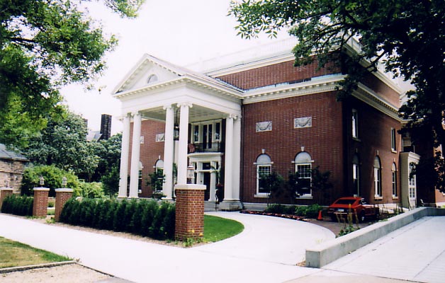
 This is the Woolworth Building in New York. It is Cass' most famous Skyscraper in New York.


This is Clarence H. Johnston, he was an American Architect. Minnesota claimed him as the State Architect in 1901. He built a lot of Universities, schools, homes, and he built the Minnesota State Fair Grandstand. He only has builds in Minnesota. Clarence was also more of a selfless architect, and he did everything to please his clients.


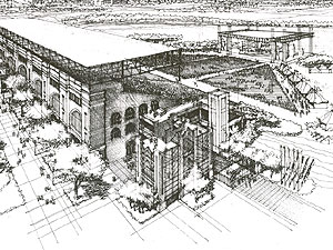
These are old Images of the Grandstand. The one on the left is a drawing of it.


Comparison Of Architecture:

Gilbert and Johnston both studied at Massachusetts Institute of Technology for their Architectural degrees. This is partially why their builds are so similar.
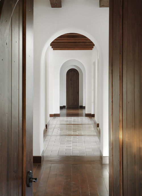
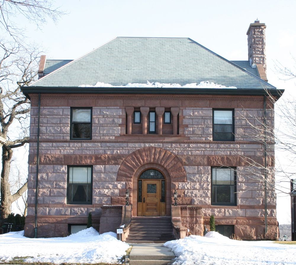
Cass Gilbert's build on Summit Ave.
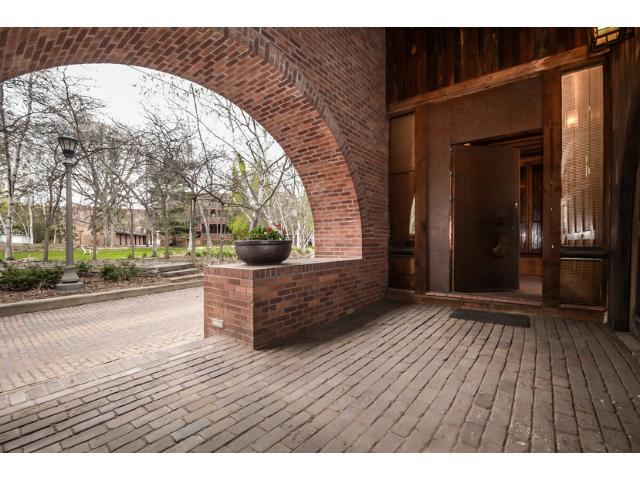
Clarence Johnston's build on Summit Ave.

    Both of the houses that they built on Summit Ave. both have a symmetry to it. They both used almost the same materials, and windows. they also both put detail into their designs. Both of these architects are very skilled, and were worthy of their titles. If I were to say witch one won in fame would be Cass Gilbert, but in personality it would be Clarence Johnston. So they both win, but in different ways.

Thursday, October 22, 2015

Exploring Summit Ave.

     On the Summit Ave. Tour we saw many beautiful houses and learned so much about them and their history. My favorite house on Summit Ave. is the Louis and Rose Silverstein House. It isn't much of my taste on the outside, but inside is quite beautiful.


The Owners had the house built during the roaring twenties, 1924 to be exact. Louis Silverstein was president of a women's wear wholesale company, and his wife convinced Mr. Silverstien to get the house built. The house was built so there would be to living quarters, so Rose's Russian mother had her own living space, but still lived with them. The architect was the Minnesota Architect Peter J. Linhoff, and he designed the home for the Silverstein's. The home is a Colonial Revival/ Mediterranean Revival. The house is now owned by The Olson's and Amy Olson's parents. When they fist viewed it they knew it was big enough for everything they need (tennis court and two living spaces), but it had a couple problems. It was dark, it had a leaky roof, and the walls were rotting. the house needed an immediate renovation to make it safe and healthy to live in. With the renovation they tried to preserve as much of the original build as they possibly could. They made the home for modern standard living, but kept many of the historic character to it. Below I will have pictures of what the home looks like now.


These are the two kitchens in the two separate condos.


One of the bathrooms in the home.


This is what both of the living spaces look like in each condo. They each have their own style of decor, but both of the rooms are designed the same.


This is the main hallway on the lower level.

        This house is very beautiful in my opinion, and I really do believe they mixed the right amount of modern and history in this home. Even though I didn't get to see the house in person, it is nice to learn about other historic, and amazing homes, on the ave.